The Apple, the Lawyer and the Pear
Designing a logo is the most paradoxical of creative endeavours. A great logo is confoundedly simple, yet satisfyingly sophisticated. A great logo is instantly recognisable, without ever having been seen before. And a great logo looks effortless, concealing weeks of work and a mountain of rejected scribbles. Is it any wonder that great logos are few and far between? In my 25-plus year design career, I’ve produced many fine logos, but maybe only two or three great ones.
Most people would agree (brand wars aside) that Apple has a great logo. It has certainly helped them create one of the strongest brands of the modern era. Nonetheless, in the tradeoff between simplicity and originality, it leans toward the former. There’s no inventive use of negative space, no clever double-meanings, no deep symbolism—it is, basically, a simplified representation of a physical apple. Without the iconic ‘bite’, one might even dare to call it pedestrian. Yes, the difference between a great logo and a forgettable one can be subtle. The difference between visual cliché and expressive symbol can be a slightly different way of seeing and depicting something common—even an apple with a bite.

The real value of Apple’s logo is, of course, tied to the value of the Apple brand, and that has been built over forty-plus years. Understandably, Apple wants to protect its brand, and it keeps a legion of lawyers for that very purpose. Some sovereign powers seek to protect their borders with walls; others seek to extend their borders through sleight of hand or show of force. Apple, it seems, believes that the territorial waters of its iconic brand extend far beyond the humble apple, encompassing all manner of fruit. Even pear-shaped ones.
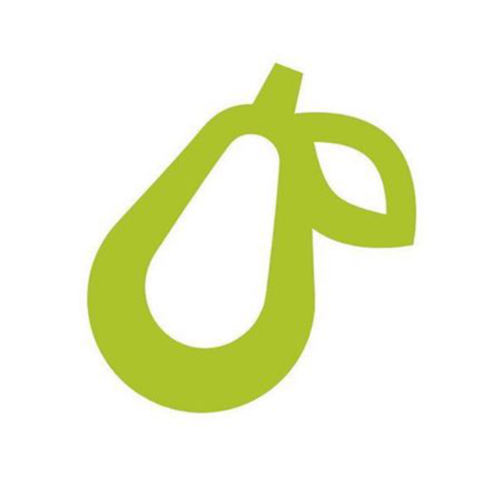
This week you may have heard about a small business called Prepear. Prepear developed a cooking app. It has a logo, which looks a lot like a pear:

Prepear applied for a small business trademark to protect its brand. Apple responded by submitting a formal ‘Notice of Opposition’ to the US Patent and Trademark Office, citing unacceptable ‘similarities’ between the two logos.
You might have noticed that Prepear’s logo isn’t an apple, and it has no bite. That much is plain to any pre-schooler, who could rule on this case with as much good sense as anyone. But this is the adult world, and adults like to complicate things. Apple’s own statement details the offending design elements:
[Prepear’s] Mark consists of a minimalistic fruit design with a right-angled leaf…
You can read Apple’s entire complaint here, but in terms of claimed ‘similarities’, this is what it all boils down to. Minimalistic. Well, that describes every corporate logo from the last 100 years. Fruit. Does Apple have a monopoly on fruit shapes? Certainly not. That leaves us with… well, leaves. (Apple’s lawyers called the leaves ‘right-angled’, but they may be lawyers because they failed maths/geometry.) Yep, they’re both almond-shaped leaves, and they’re both right-leaning. One is an outline, and facing-down, whereas the other is solid and facing-up, but you know… they’re kind of, sort of, a tiny bit similar.
If Apple is right, and that kind of similarity disqualifies a logo from being trademarked, then you may as well close down the Trademark Office right now, because no logo is going to survive that kind of comparison.

Swift logo
(2014, Apple Inc)

Hammer and Sickle logo
(1922–1955, flag of the Soviet Union)
Nonetheless, Apple’s lawyers are claiming that Prepear’s logo ‘creates a similar commercial impression’ to Apple’s, and that consumers who see Prepear’s logo ‘are likely to associate the mark with Apple’. In other words, they think the pear logo will somehow trigger people to think of Apple—a lot like that word association game you try and get your kids to play on a long road-trip. You know the one… You say ‘Pear’, the kids say ‘Apple’, you say ‘Orange’, the kids say ‘Can we stop this game now?’
But is it true? Will Prepear’s logo make people think of Apple? Yes. But only because Apple’s lawyers made and documented the dubious connection first, in what has now become a media-fuelled, self-fulfilling prophecy. In other words, Apple shot themselves in the fruit.
Would it have been true if Apple hadn’t taken this action? I guess it depends on who you ask, or rather how you ask…
Apple’s Notice of Opposition makes this claim:
The Apple Marks are so famous and instantly recognizable that the similarities in Applicant’s Mark will overshadow any differences and cause the ordinary consumer to believe that Applicant is related to, affiliated with or endorsed by Apple.
Like a virus which spreads exponentially, so, Apple’s lawyers seem to believe, is the power of their brand over the poor minds of consumers, whereby even a vague similarity of form can further the rate of infection. This, it seems, requires a new level of artistic distancing, and the quarantining of any logo that features an edible fruit with (or without) a right-leaning leaf. According to Prepear’s founder, Natalie Monson, ‘Apple has done this to dozens of other small business fruit logo companies, and many have chosen to abandon their logo, or close doors.’
Even if you can point to a single consumer who (having never before seen Prepear’s logo, or heard about Apple’s objection) would look at the Prepear logo and mistake it for Apple’s branding, I would argue that you can really only blame Apple’s ubiquity for that, and perhaps the illogical tendencies of the human brain—neither of which should be held against a small business trying to make an honest go of it in the competitive world of app development.
Disclaimer: I’m not a lawyer. This is my opinion as a developer, designer, consumer and (on most days) happy Apple customer.